Encore
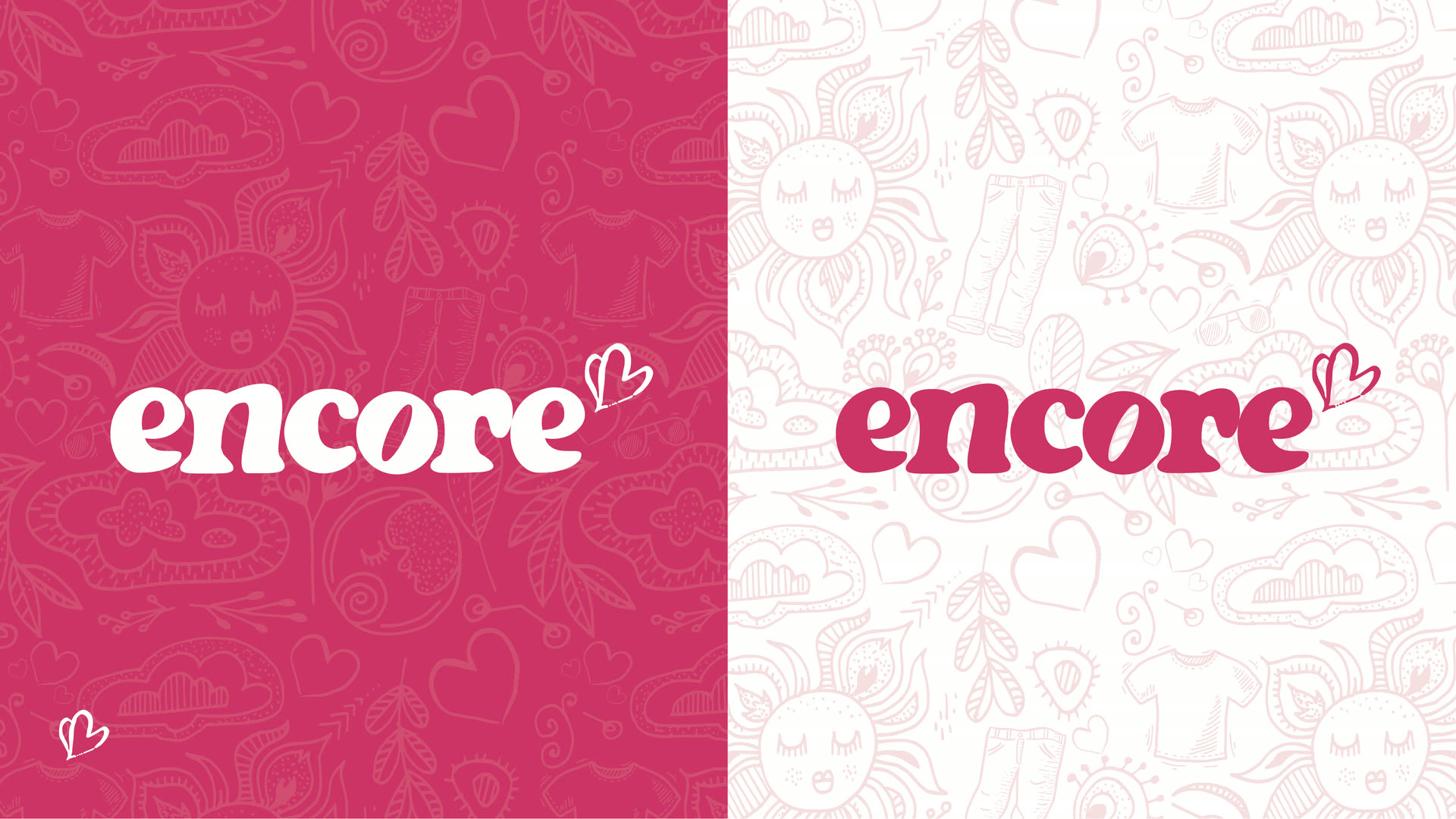
The mark · a rounded wordmark and a hand drawn heart
Overview
A thrift store where every dollar funds free hospice care, and an identity warm enough to earn the browse.
Encore is garments and goods to re-love in support of Hospice Halifax. The brief was to make secondhand feel like somewhere you want to shop, not somewhere you go out of duty. A rounded wordmark and a hand drawn heart carry the warmth, and Work Sans SemiBold sets the voice: clear, approachable, human. A doodle pattern of garments, suns and hearts gives the brand its texture, sitting under the logo without ever competing with it, and the whole system reaches the shop floor on totes and swing tags before it ever reaches the street.

Doodle pattern · garments, suns and hearts
Brand colours
Five tones that run from compassion to depth.
Light Pink leads the system because it stands for compassion, optimism, and the warmth at the heart of Hospice Halifax. Roseberry carries pattern fills and gradients, Mid Plum adds depth on light backgrounds, and Dark Burgundy holds the tagline beneath the mark. Tap any swatch to copy its hex.
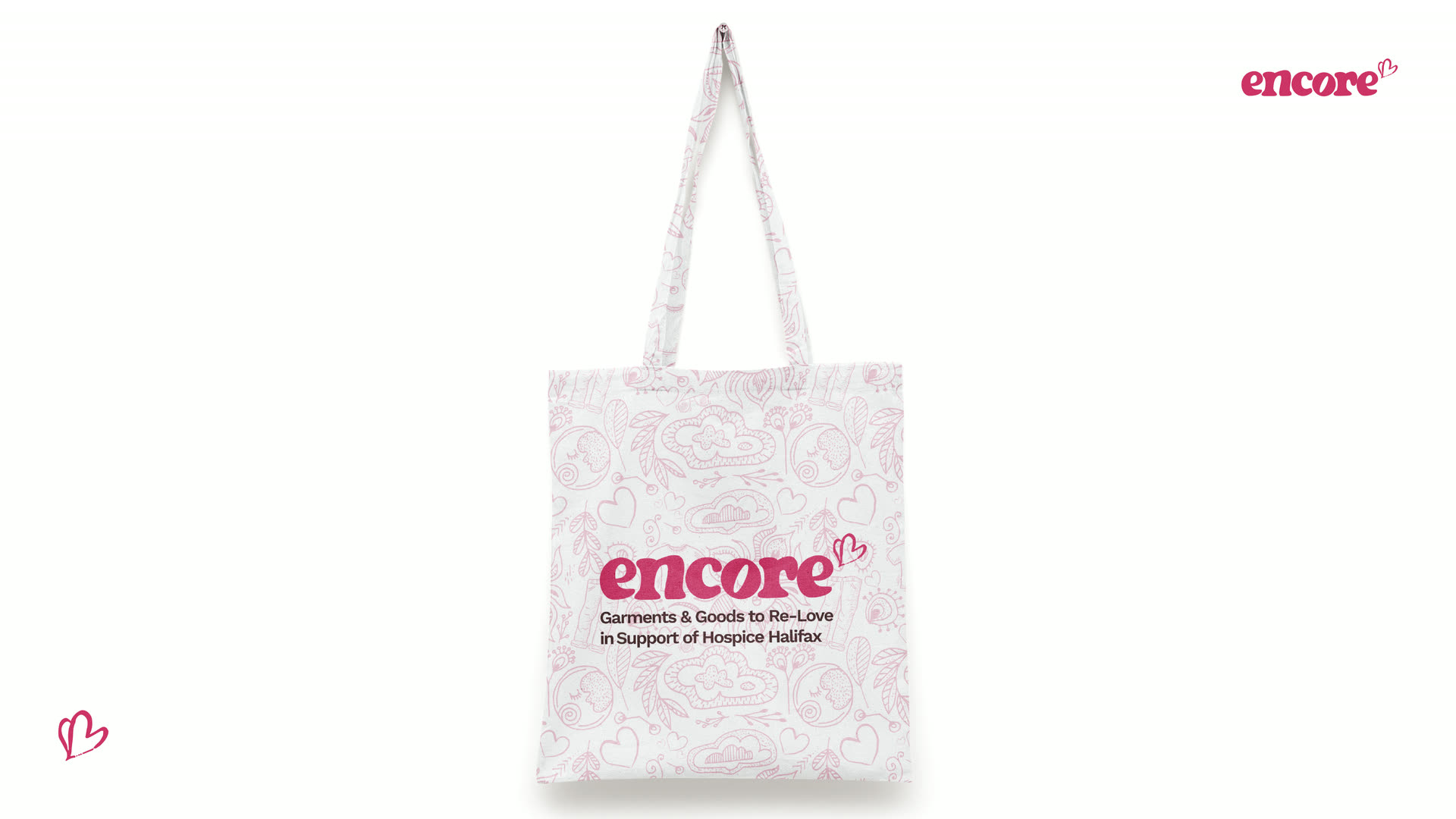
Tote · the pattern at retail
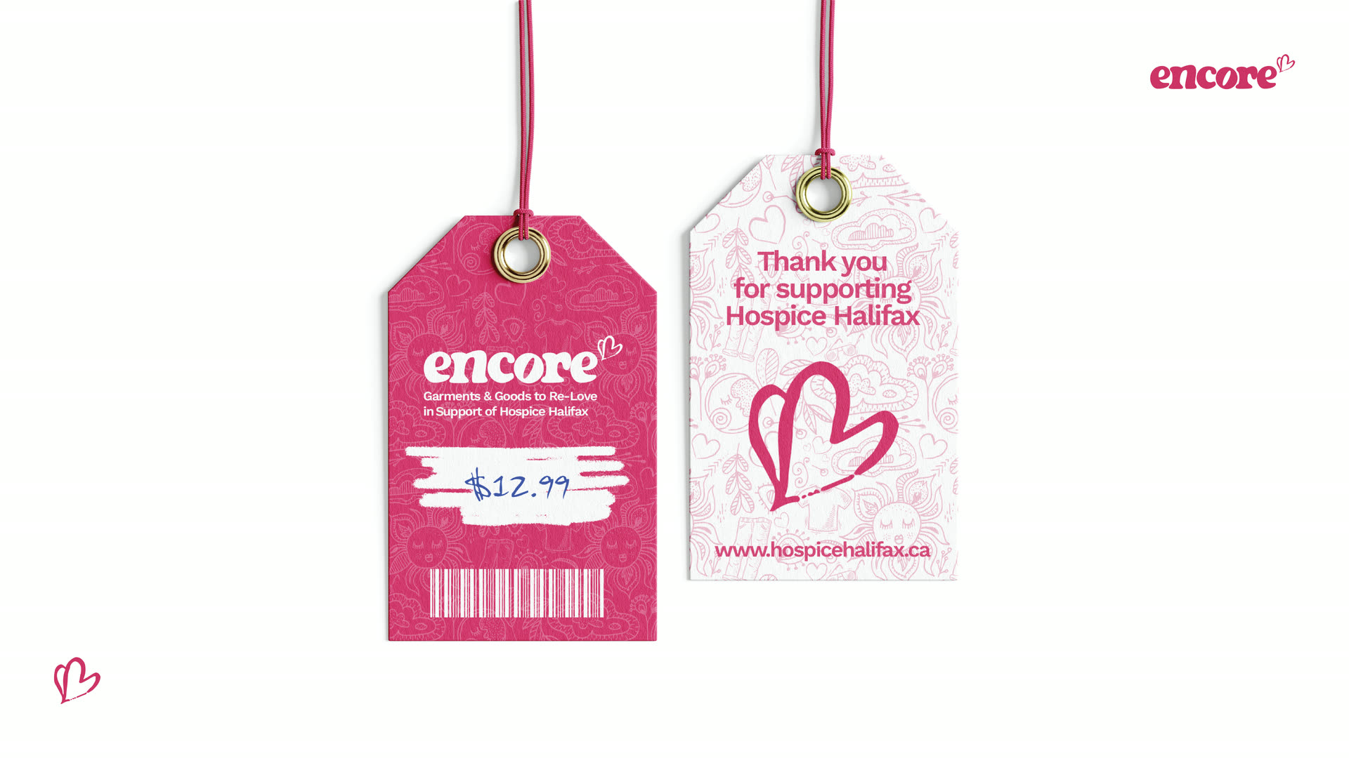
Swing tags · front and back
Out in the world
The brand takes to the street.
A pair of citylights at Richmond Yards put the promise in plain words. One lets a single re-loved garment do the talking; the other hands the whole panel to the pattern. Both close the same way: make secondhand shopping purposeful.
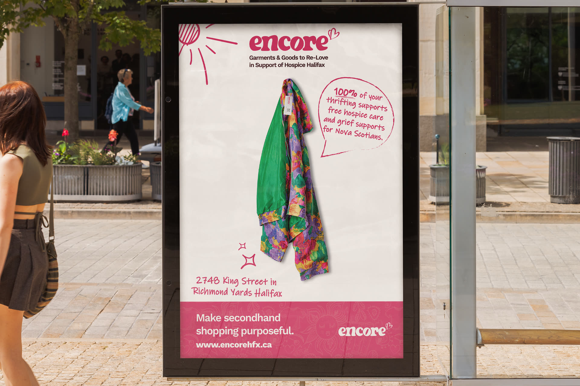
The product does the talking
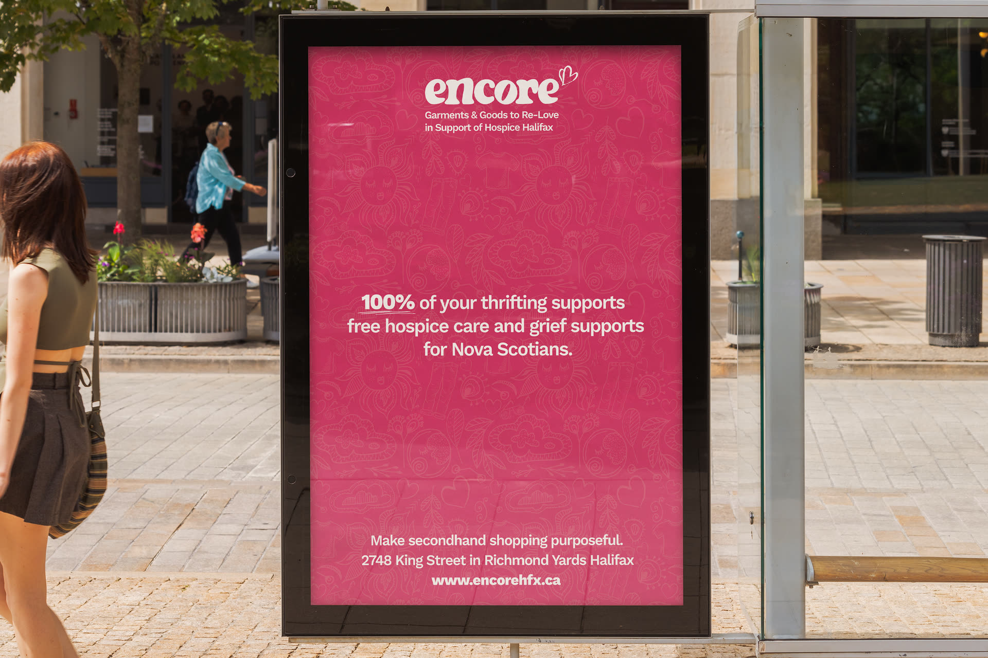
Pattern, palette, and the promise
What we made