Goat Automotive.
Overview
Goat Automotive wanted a brand as sharp as the work under the hood: bold, fast, and impossible to forget.
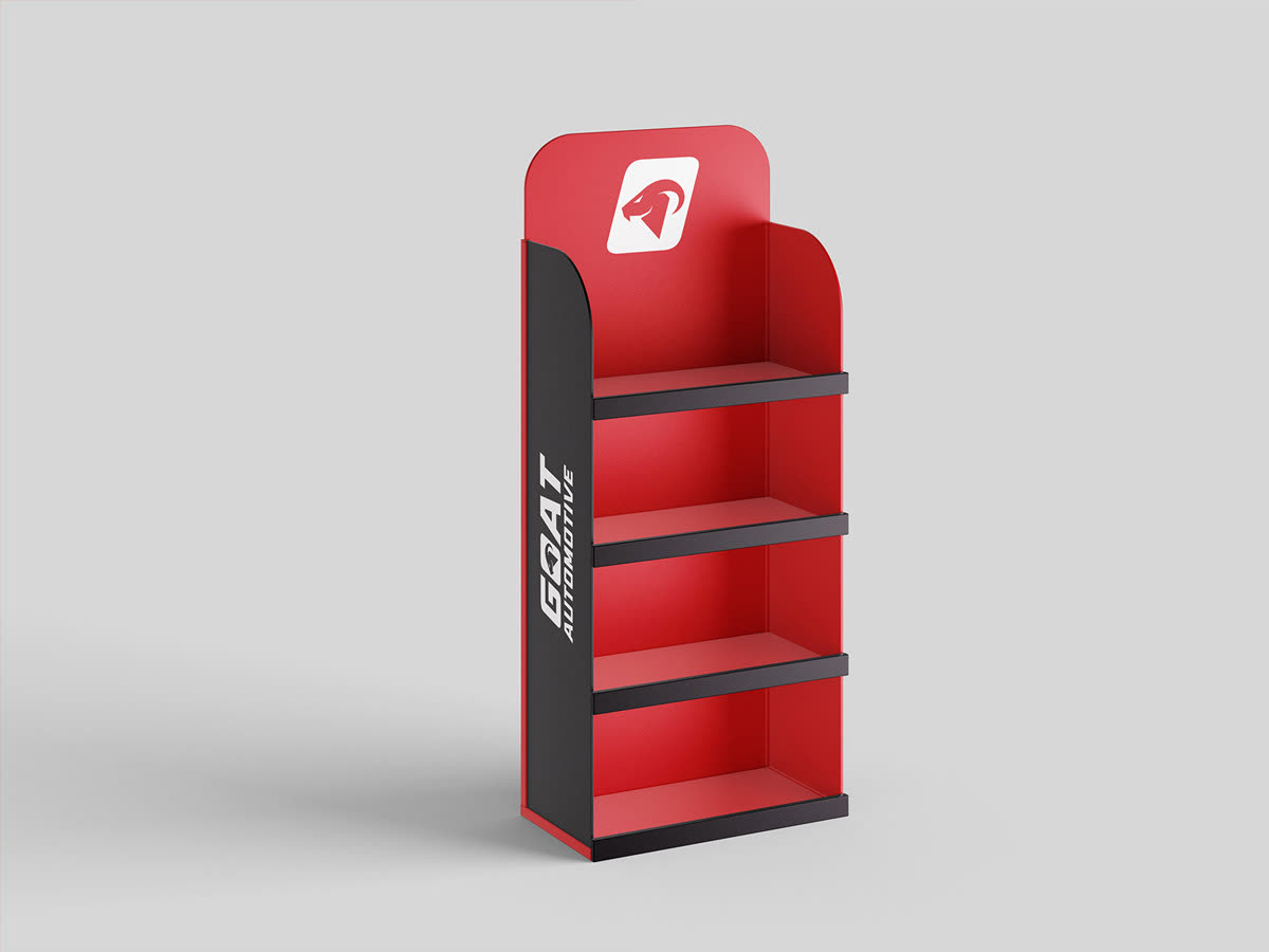
We built a full identity for the Atlantic Canada repair shop, from a hard-charging italic wordmark and a goat-head emblem to a racing-red colour system, a mascot named Auto, and every touchpoint in between. Strong contrast, aggressive angles, and a confidence that reads just as loud on a business card as it does on a billboard.
The mark
One mark, built to move.
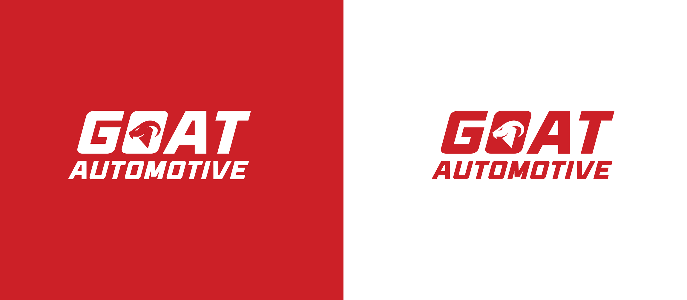
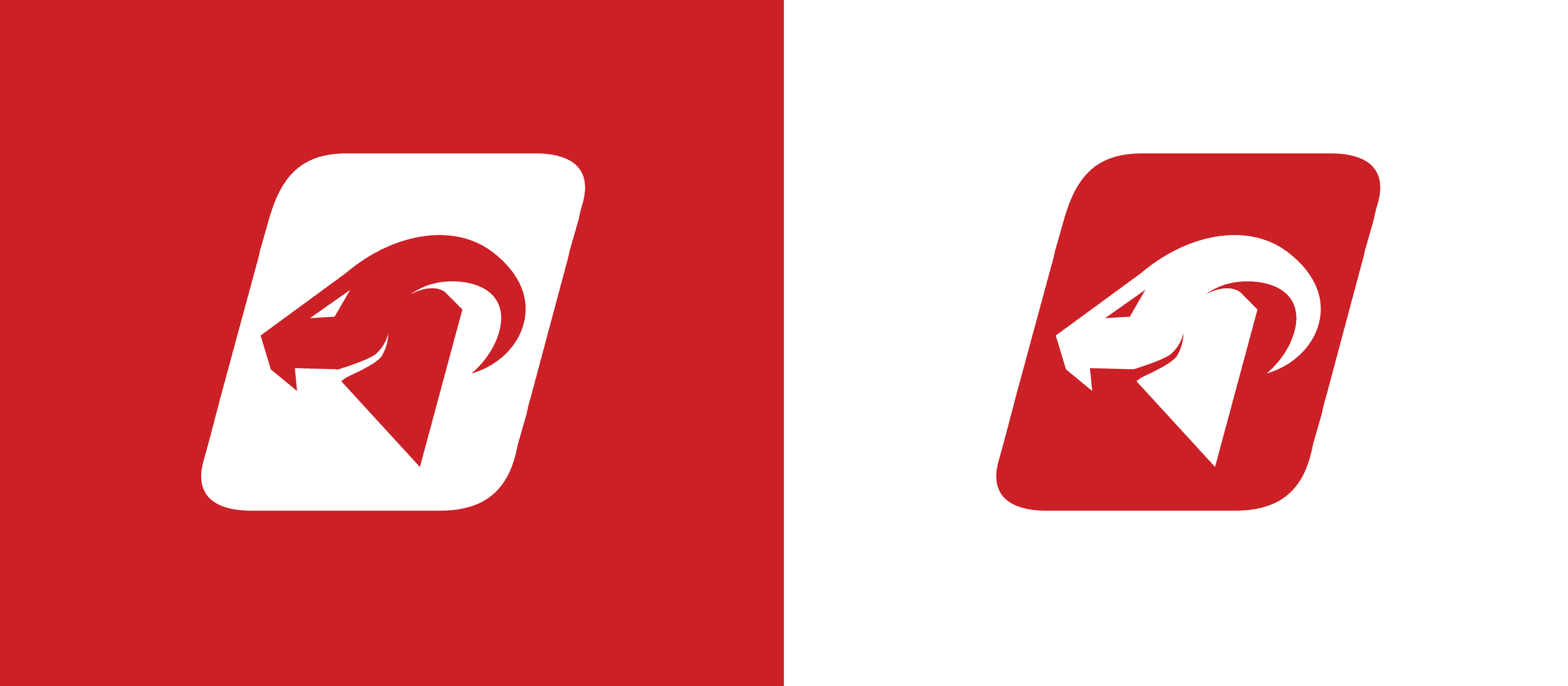
A bold italic wordmark with the goat's horn curling through the O, plus a standalone emblem for when the badge has to stand on its own. Both hold their weight in racing red or reversed to white.
Brand colours
Racing red, carbon black, steel grey.
A high-contrast, high-impact system built around one energetic red, grounded by carbon black and steel grey for depth and legibility. Tap any swatch to copy its hex.
Typography
Avega on the attack, Aldrich in support.
Avega carries the logo and headlines with a fast, italic drive. Aldrich handles everything else with clean, mechanical clarity.
Avega Italic
Primary · Logo + Headlines
Aldrich
Secondary · Body
What we made