Slipp Construction.
Overview
Slipp Construction needed a brand that carried the same weight as the work: sharp, grounded, and unmistakably theirs.
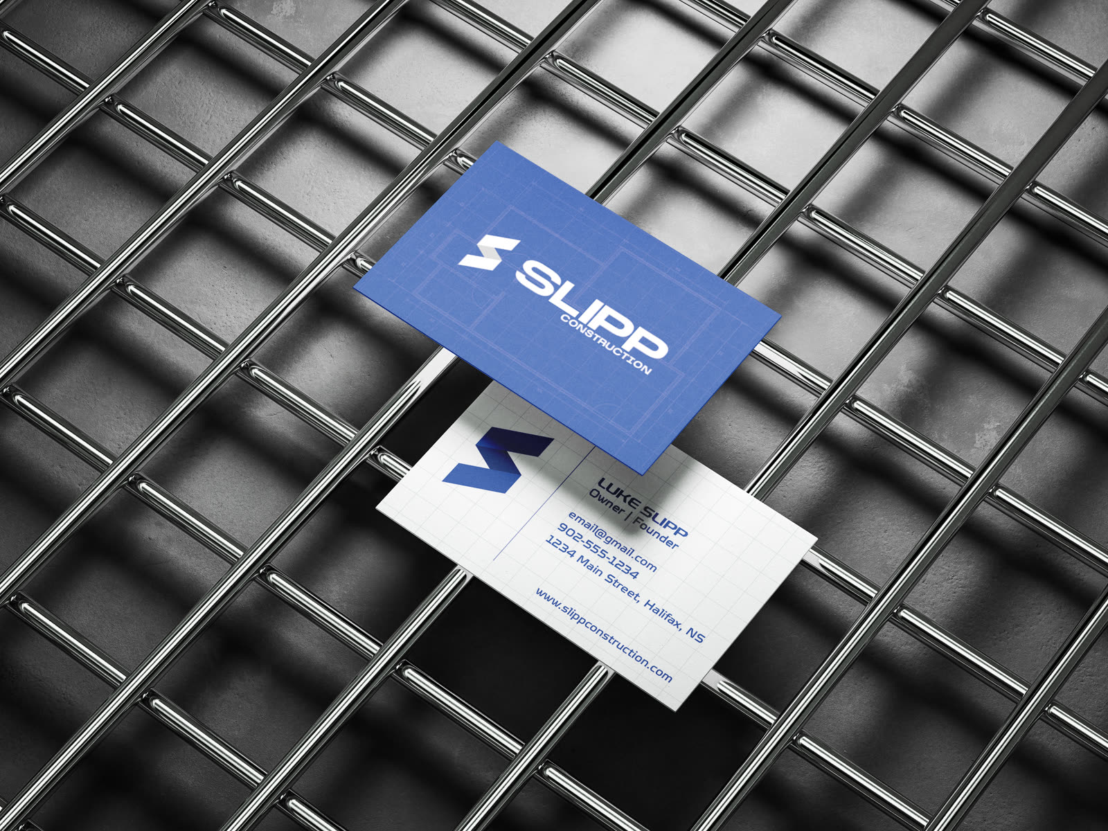
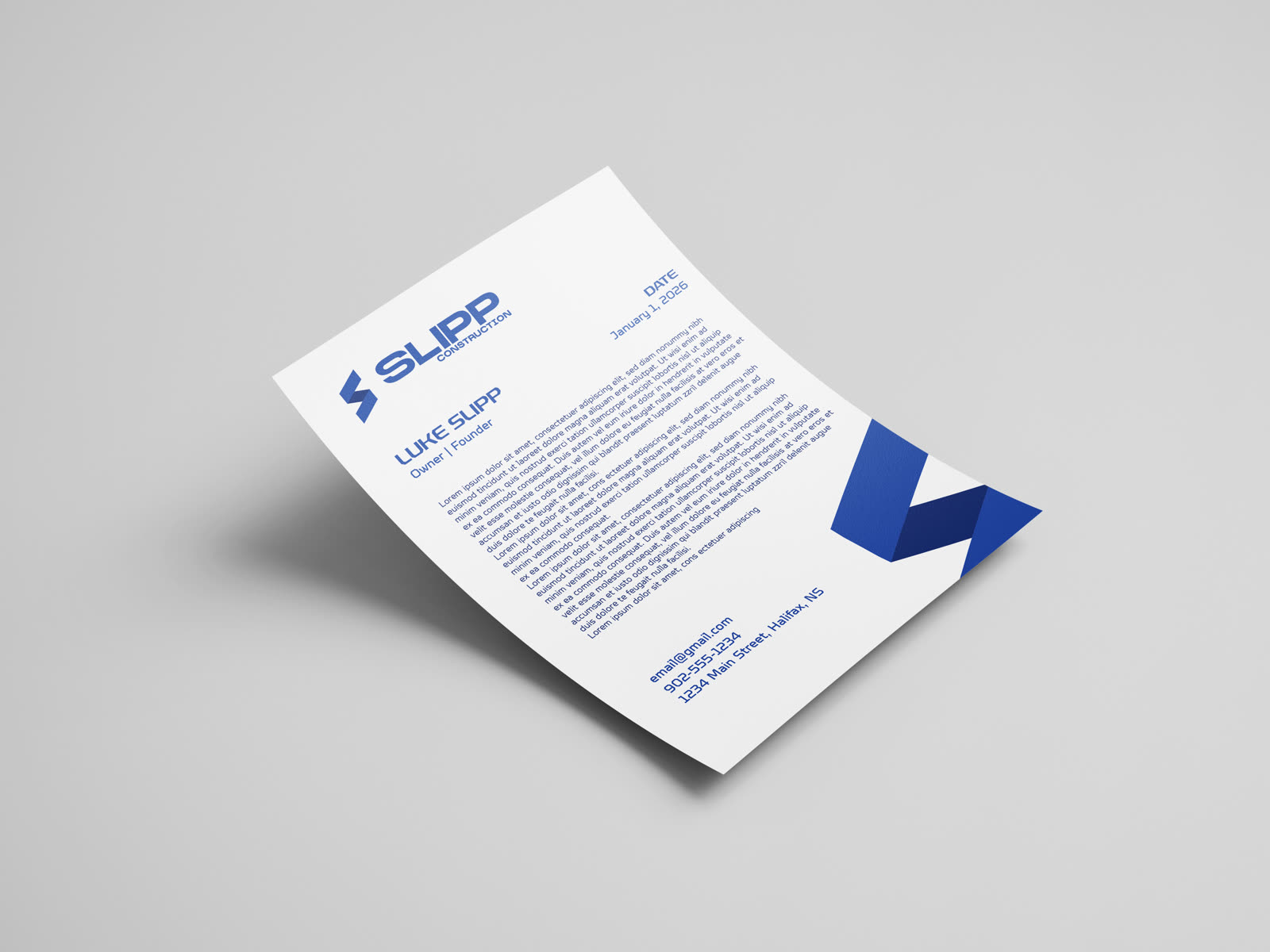
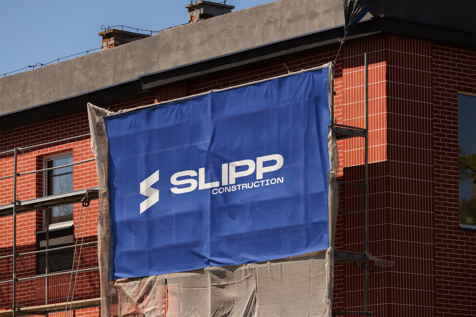
We built the identity from the ground up and put it straight to work, from the cards in your hand to the sign on the fence. Then we took it to screen with a website film and a Meta ad campaign that put the crew, the sites, and the standard Slipp holds itself to front and centre.
The challenge
Construction branding tends to blend into the background. Slipp's couldn't.
Plenty of good builders look interchangeable: hard hat clip art and stock photography that could belong to anyone. Slipp does careful, high standard work, and needed a brand to match, one that reads premium and trustworthy across a business card, a site banner, and a fifteen second ad, without losing the grit of the trade.
What we made
The campaign
Then we put the brand in motion.
Two Meta ads, cut for the feed and built to stop the scroll: real crews, real sites, and Slipp's identity carried from the first frame to the last.