YEW.
Overview
YEW is a healthy-aging nutraceuticals brand built on one promise: age slower, live stronger.
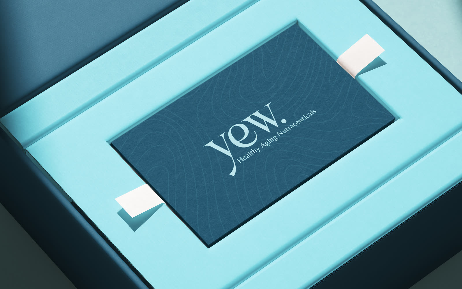
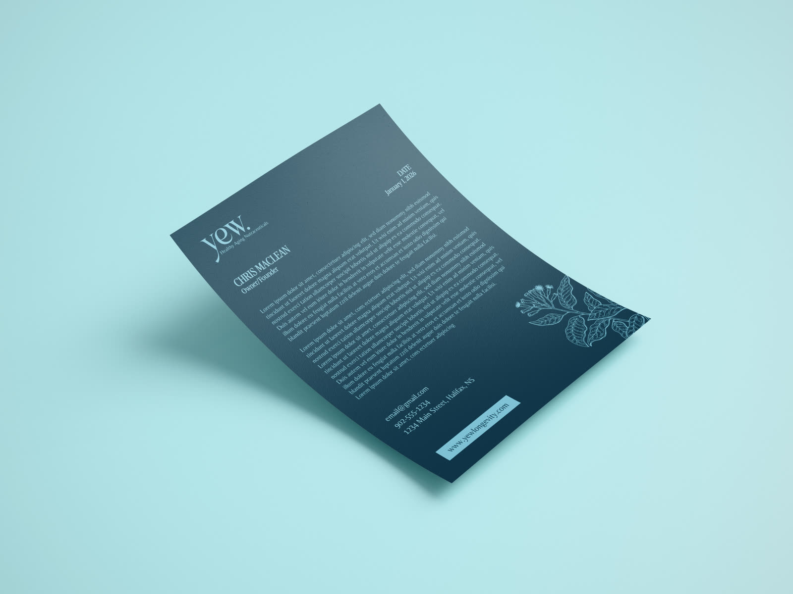
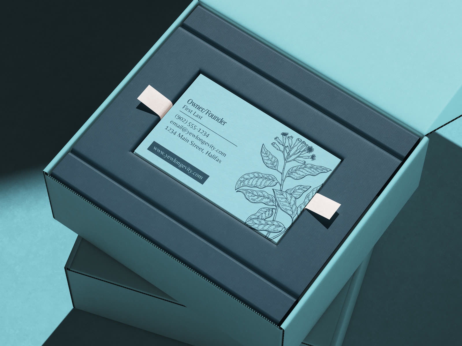
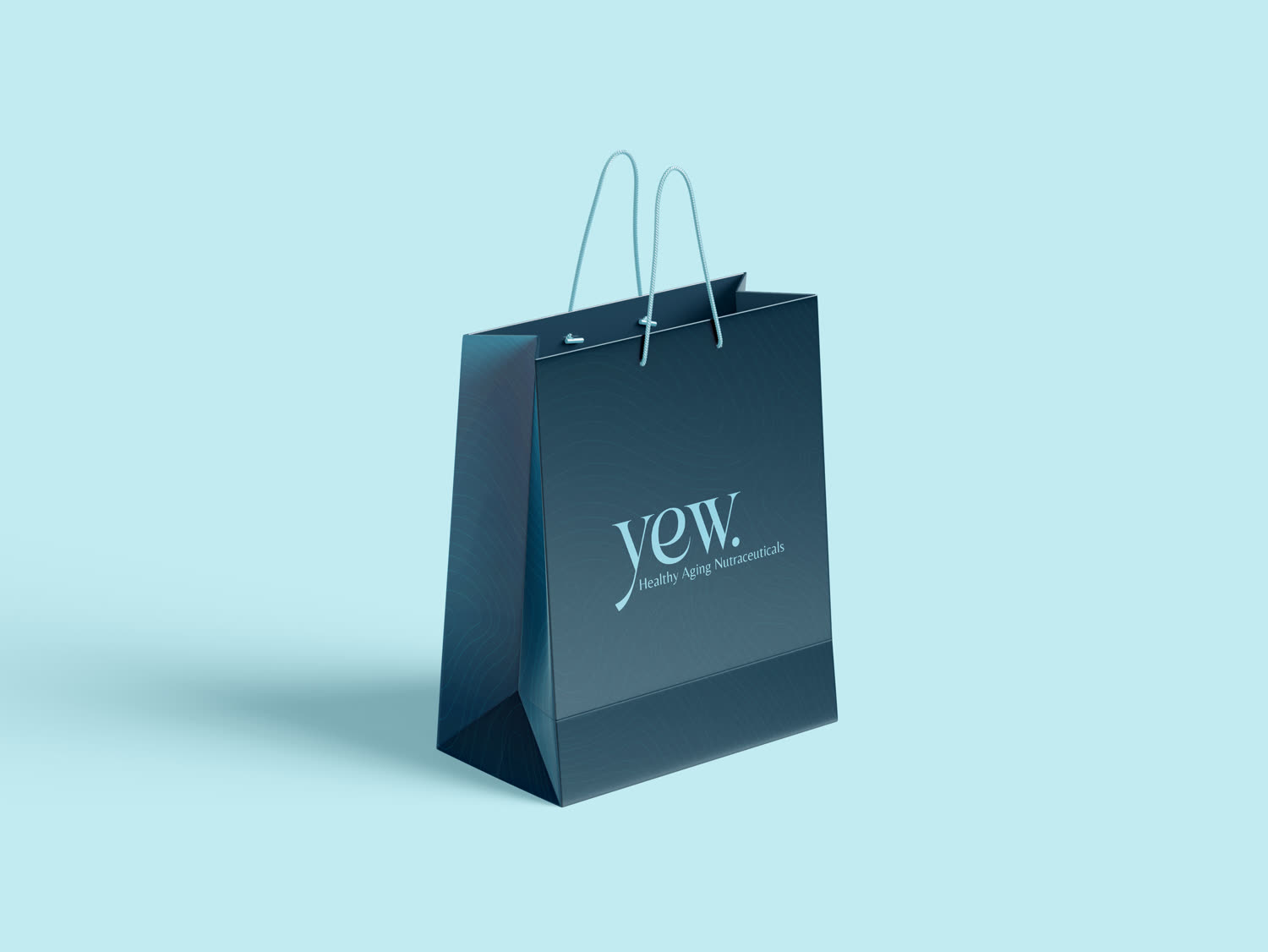
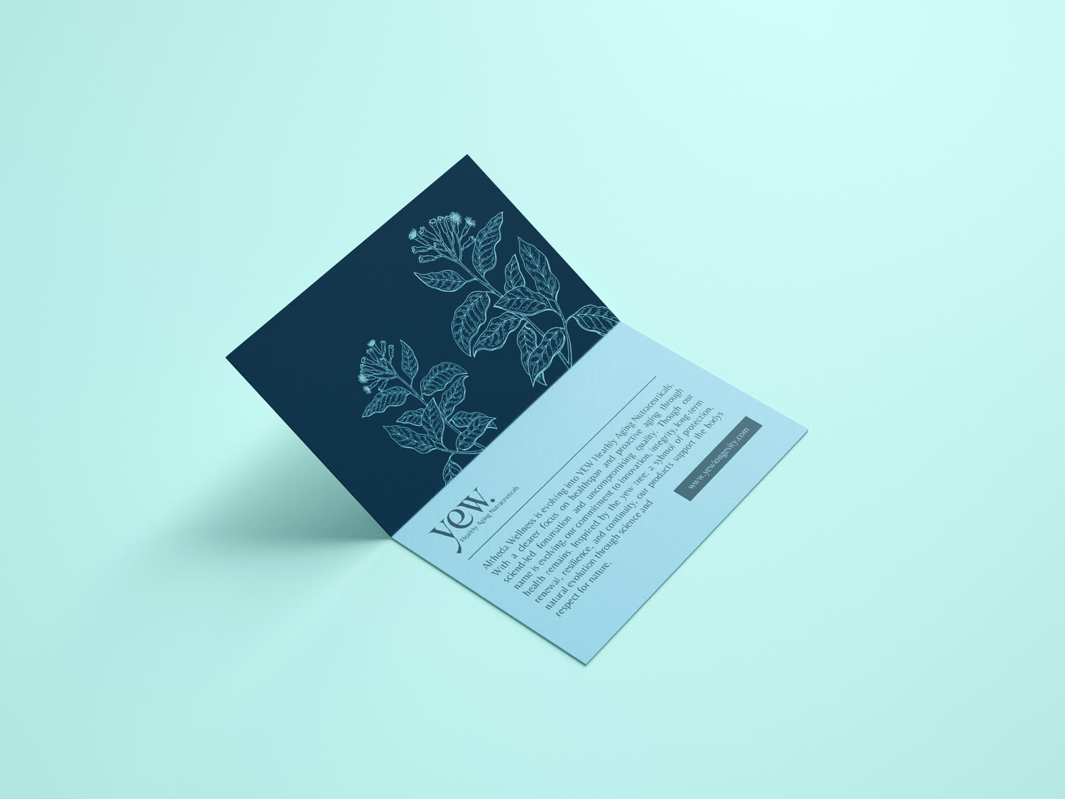
We took Altheda Wellness and rebuilt it as YEW, a name and identity drawn from the yew tree, one of the longest-living things on earth. The result is calm, credible, and unmistakably premium: a refined wordmark, a botanical illustration style, an organic pattern pulled from the tree's own rings, and a colour system that balances science and nature. From the business card to the packaging, every touchpoint speaks the same quiet, confident language.
Brand colours
A palette that balances science and nature.
Four colours carry the brand, from the optimism of a clear sky to the deep, enduring green of the tree it's named after. Tap any swatch to copy its hex.
Typography
A refined serif, a calm sans.
Advercase leads with an elevated, enduring serif for headlines and brand statements. Belleza supports it with clean, quietly confident body copy.
Advercase
Primary · Headlines
Belleza
Secondary · Body
What we made